
Over the last fifteen years, web and app UI design has undergone a massive shift. We’ve gone from fixed layouts to responsive design, which came from the proliferation of mobile devices accessing the web. Before smartphones, we could mostly get away with designing UIs that fit on an average-sized desktop computer or laptop.
However, once everyone had the mobile web in their pocket, it became vital to design for small screens, too. Then came tablets, phablets, massive screens and watches with web browsers, and for a while, we were creating variations of our UI layouts for the height and width of each specific device. Sometimes, we just picked our favorites. It was bad.
0:00
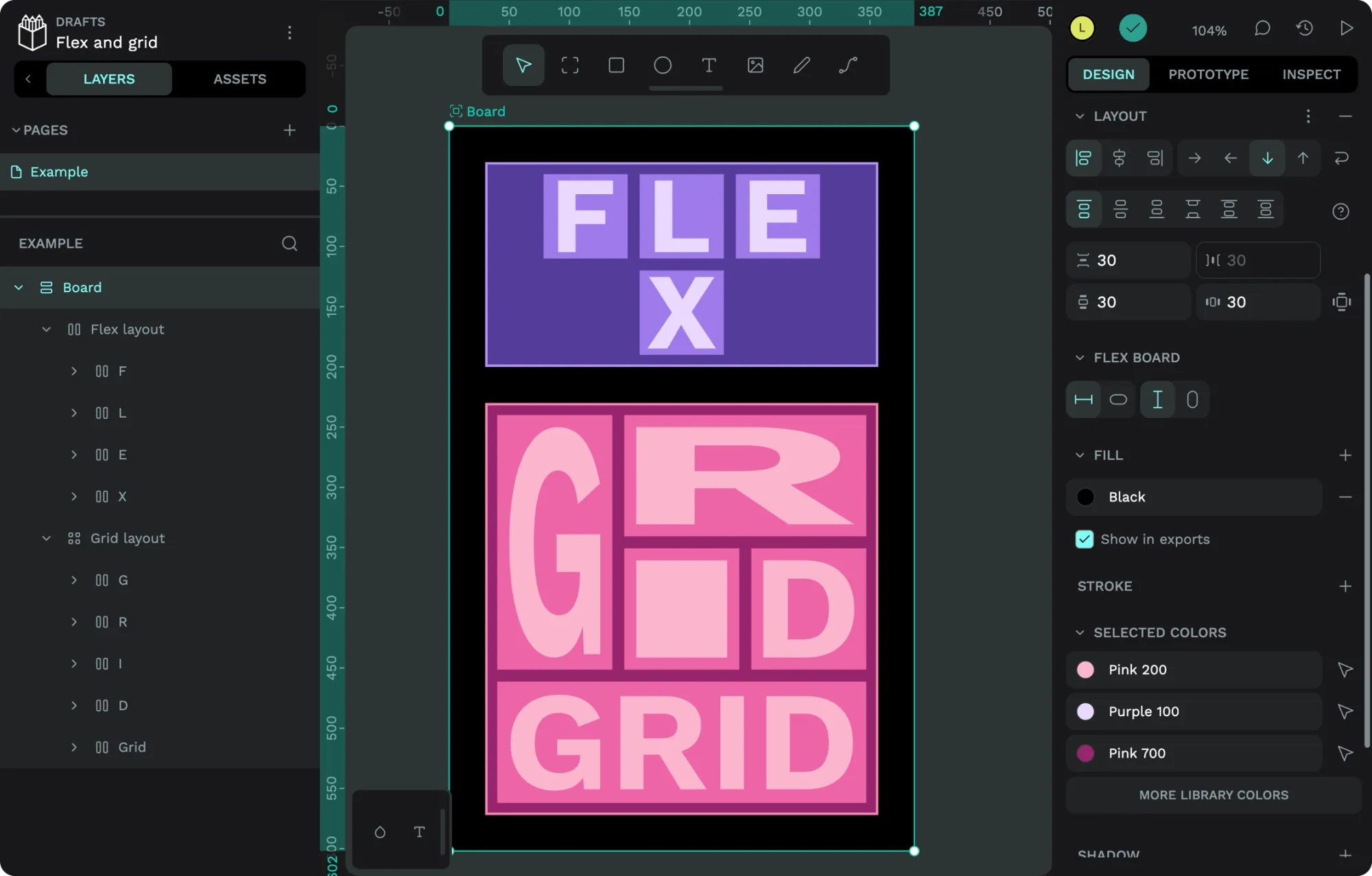
The CSS Flex layout can wrap across multiple rows. The CSS Grid layout fills the available height and width.
- Tutorial: How to create CSS Flex layouts in Penpot
- Tutorial: How to create responsive CSS Grid layouts in Penpot
- Tutorial: How to create CSS Flex and Grid layout components in Penpot
Responsive design taught web developers techniques to make layouts a little more flexible. It popularized the concepts of using percentages instead of pixels, images that fit the available space, and switching up the layout at particular browser size “breakpoints.”
These were revolutionary techniques for developers, but designers were usually left to keep designing multiple variations of their layouts at these different breakpoint sizes. It was a tremendous amount of work, and it was difficult for developers to translate the designs into code that worked the same way.
Developers working on CSS, the language used for coding layouts and other styles on the web, then created new layout features that built upon responsive design. CSS Flexbox and CSS Grid used a combination of new and familiar layout concepts to make it easier to build adaptive, flexible layouts on the web without having to design separately for every different device or viewport size.
Flex and grid aren’t just helpful in designing layouts that can adapt to fit different viewport and container widths and heights; they’re also necessary for building flexible design systems. When we create design systems, we often design components that must be flexible to fit unknown future layouts. Flex and grid help us design for edge cases and unpredictable situations.
Penpot uses CSS Flex and Grid layouts, so you can build layouts (without knowing how to code!) that will work the same on the web.
When you design a web app or site using Penpot’s flex and grid layouts, a developer can use the code generated from your design, displaying the layout exactly as you designed it. No translation, interpretation, or complex handoff discussions are needed. You can sign up today to use Penpot for free, with no credit card required, unlimited seats, and unlimited projects.
I’ve written a series of tutorials about Penpot layouts to help you get started with these powerful tools. Below is a handy list of these posts–I’ve ordered them from the most basic to the most advanced.
Tutorial: How to create CSS Flex layouts in Penpot
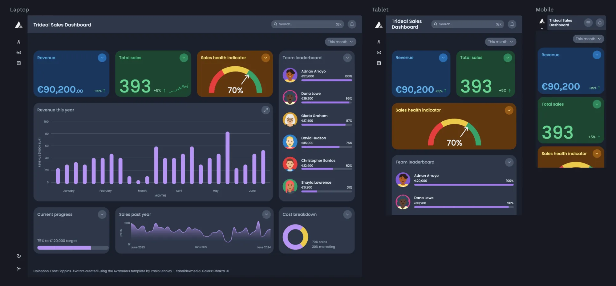
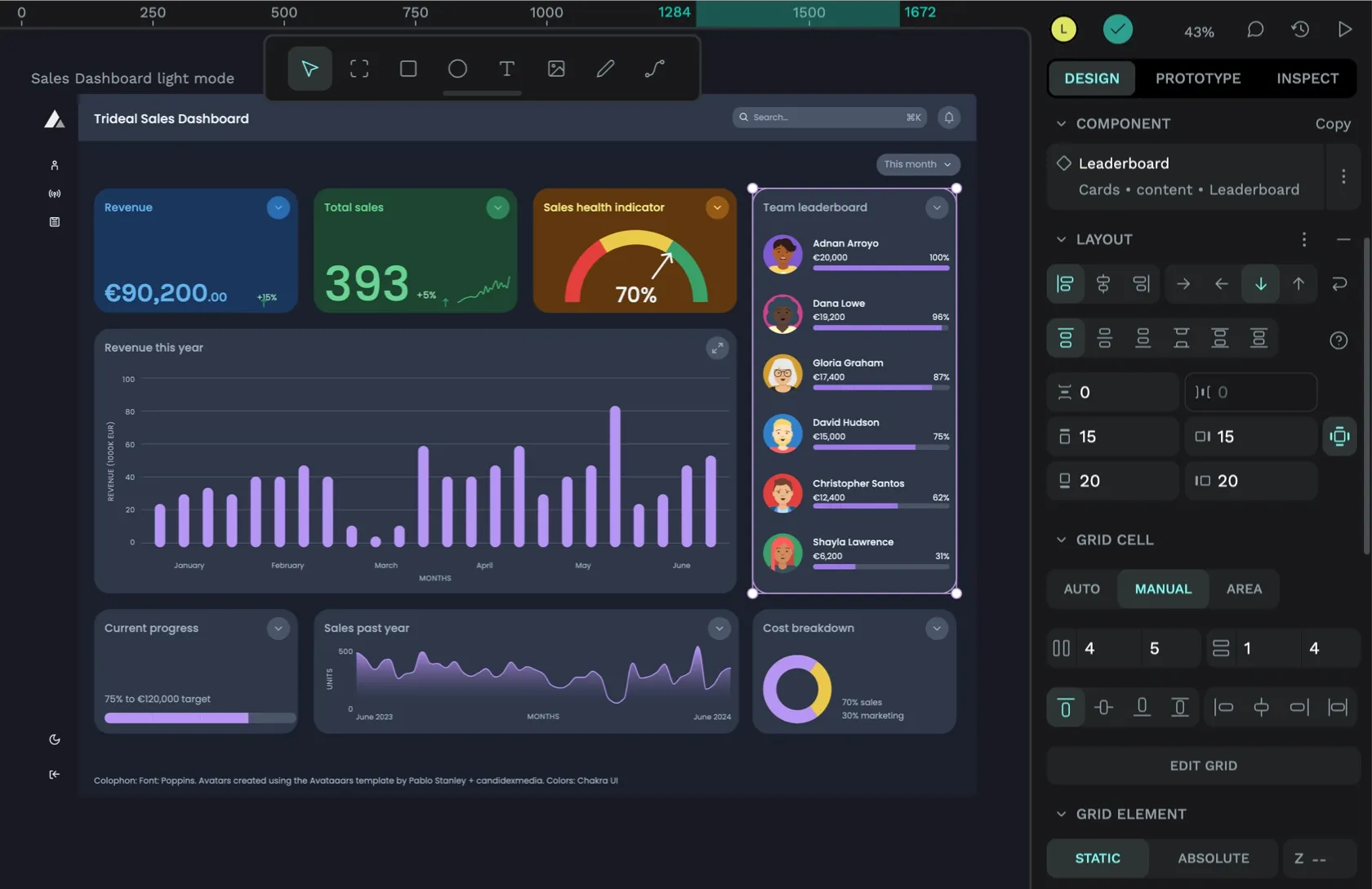
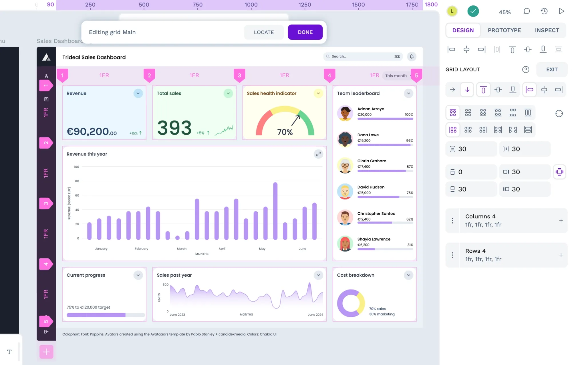
This tutorial uses our sales dashboard UI template to walk you through Penpot’s CSS Flex layout tool. Flex layouts are ideal for:
- containers with an unpredictable number of items
- layouts with changeable columns and rows
- components with variations to fit different text lengths and other content
- almost anything you need to make flexible in a UI
Tutorial: How to create responsive CSS Grid layouts in Penpot
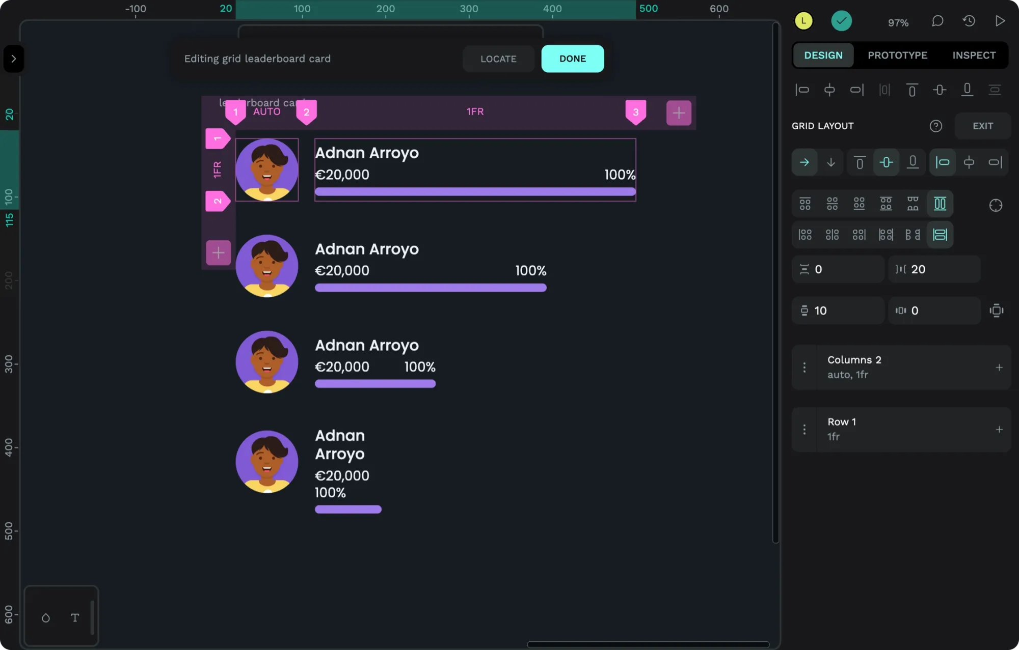
This tutorial explores creating a bento grid layout for our sales dashboard UI. Grid layouts are ideal for:
- Layouts with defined columns and rows
- Making fixed width and height content more flexible
- Sticky headers and footers
- Almost any layout you want to control
Tutorial: How to create CSS Flex and Grid layout components in Penpot
You can save Penpot flex and grid layouts as reusable components to create consistency across your design system and help speed up the design process.
Read about how to create CSS Flex and Grid layout components in Penpot and download our template, full of free layout components you can use in your designs.
Templates for learning Penpot layouts
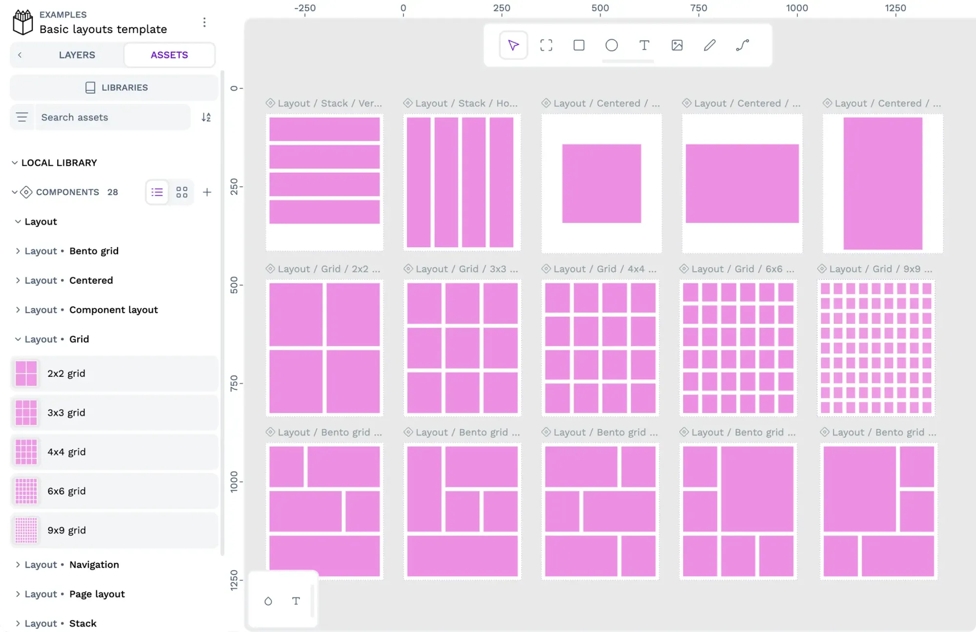
Sometimes, it’s easier to learn by creating layouts yourself or from examples of how someone else has created layouts. Below is a curated collection of Penpot templates to help you get started. You can download more Penpot templates from the Libraries & Templates page.
- Download the flex playground template
- Download the grid playground template
- Download the Sales UI dashboard example template
- Download the basic layouts example template
More tutorials are coming soon
I’ll add more tutorials in the future. If you have any requests, suggestions, or questions about Penpot layouts, please join us in the Penpot Community space. Penpot is free, and you can sign up today to start creating CSS Flex and Grid layouts for yourself.