
In Penpot, you can create flexible layouts for your designs using flex and grid layouts. Flex and grid are two ways to create modern web layouts in CSS code. But you don’t need to understand CSS to use them in Penpot!
When you design a web app or site using Penpot’s flex and grid layouts, a developer can use the code generated from your design, displaying the layout exactly as you designed it. No translation, interpretation, or complex handoff discussions needed.
Even if you’re not designing for the web, flex and grid layouts provide an easy way to create layouts by setting rules for a group of elements rather than moving and aligning your objects manually one by one. Defining the layout at the container level makes it quicker to achieve pixel precision and much faster to update and add new elements.
You can apply flex and grid layouts to whole boards or groups of layers and nest different layouts inside each other for more complex layouts.
If you want to reuse a flex or grid layout, you can save it as a component to use again in the same file or even another project. These layouts are useful for speeding up the design process and creating consistency across your design system.
How to use layout components
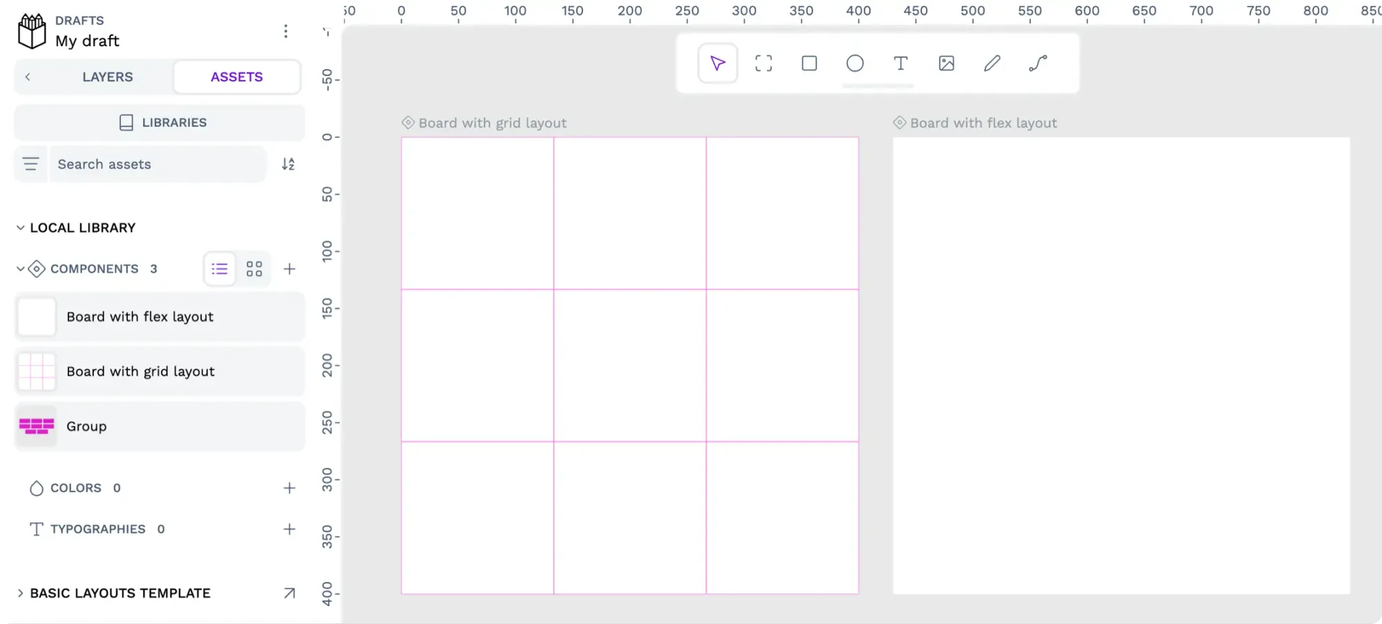
Use layout components from a shared library to quickly add flex and grid layouts to your own projects. You can download templates that include layout components from Penpot’s Libraries & Templates collection or create a shared library from one of your team’s files. If you’re looking for a quick start, you can copy a layout component from an existing file and paste it into a new one.
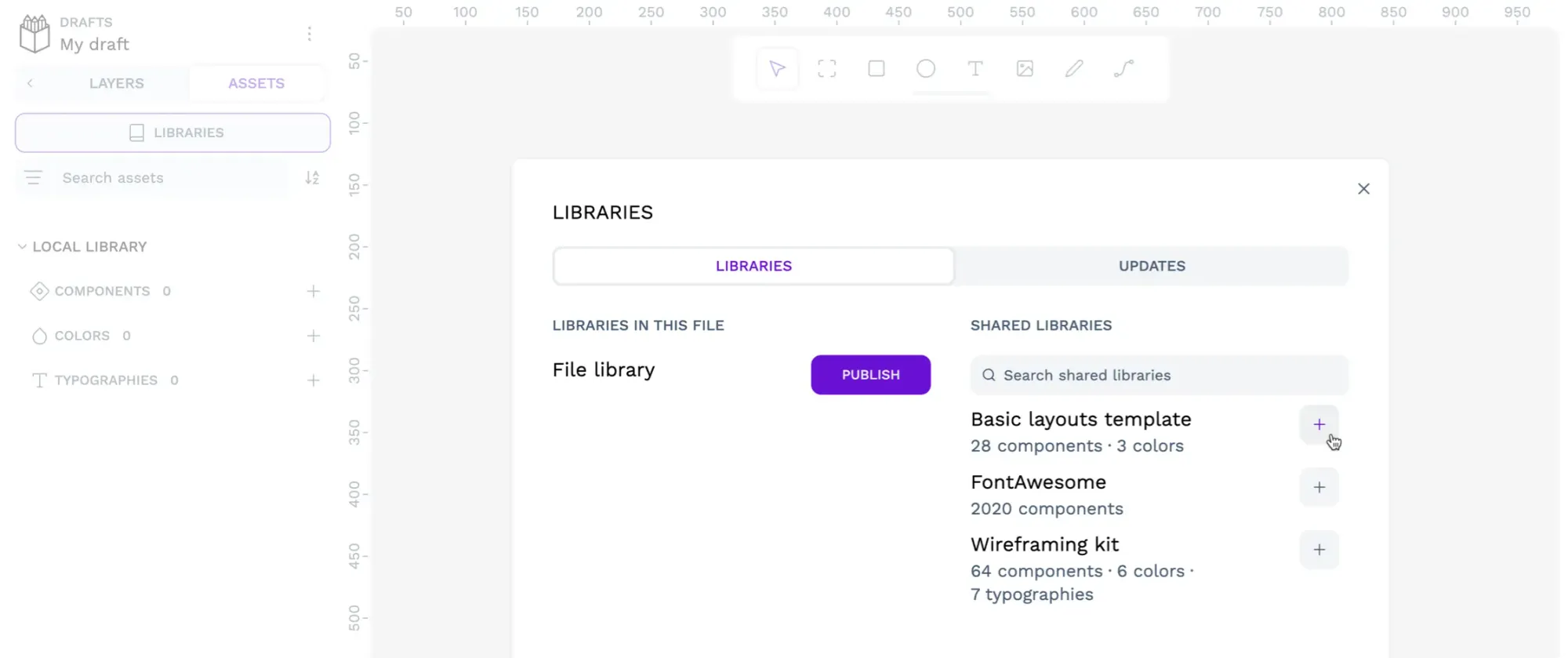
Use a layout component from a shared library
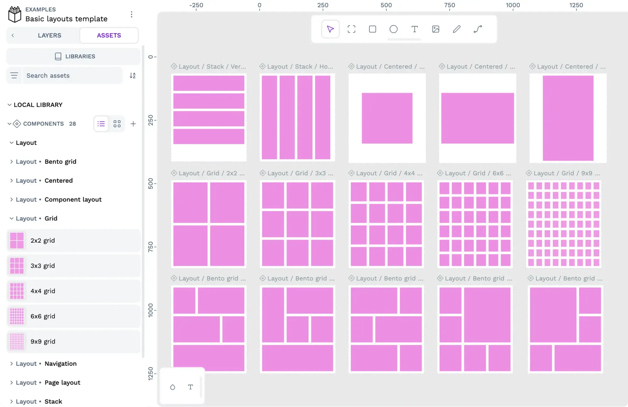
Get started quickly with the layout components in my Basic layouts template. Start by importing the template into your Penpot team:
1: Import the library or template’s Penpot file to your Penpot team
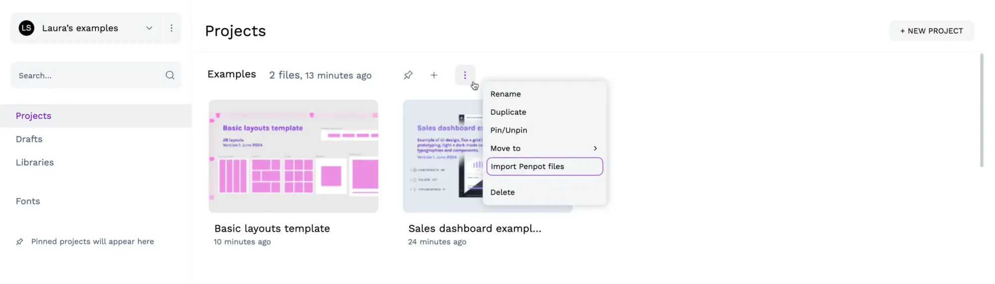
- Use the options icon button alongside any project in your team and choose Import Penpot files.
- Select the file from your computer to import it into your Penpot project.
2: Add the shared library to your Penpot file
- Enter the file where you want to use the shared library.
- Open the Libraries modal from the Assets tab in the left sidebar.
- Use the + icon button alongside your chosen library to connect the library to your file.
3: Find the component you want to use
- In the Assets tab in the left sidebar, navigate to the components under the name of the shared library.
- Explore any component groups using the > chevron icon button to expand each group.
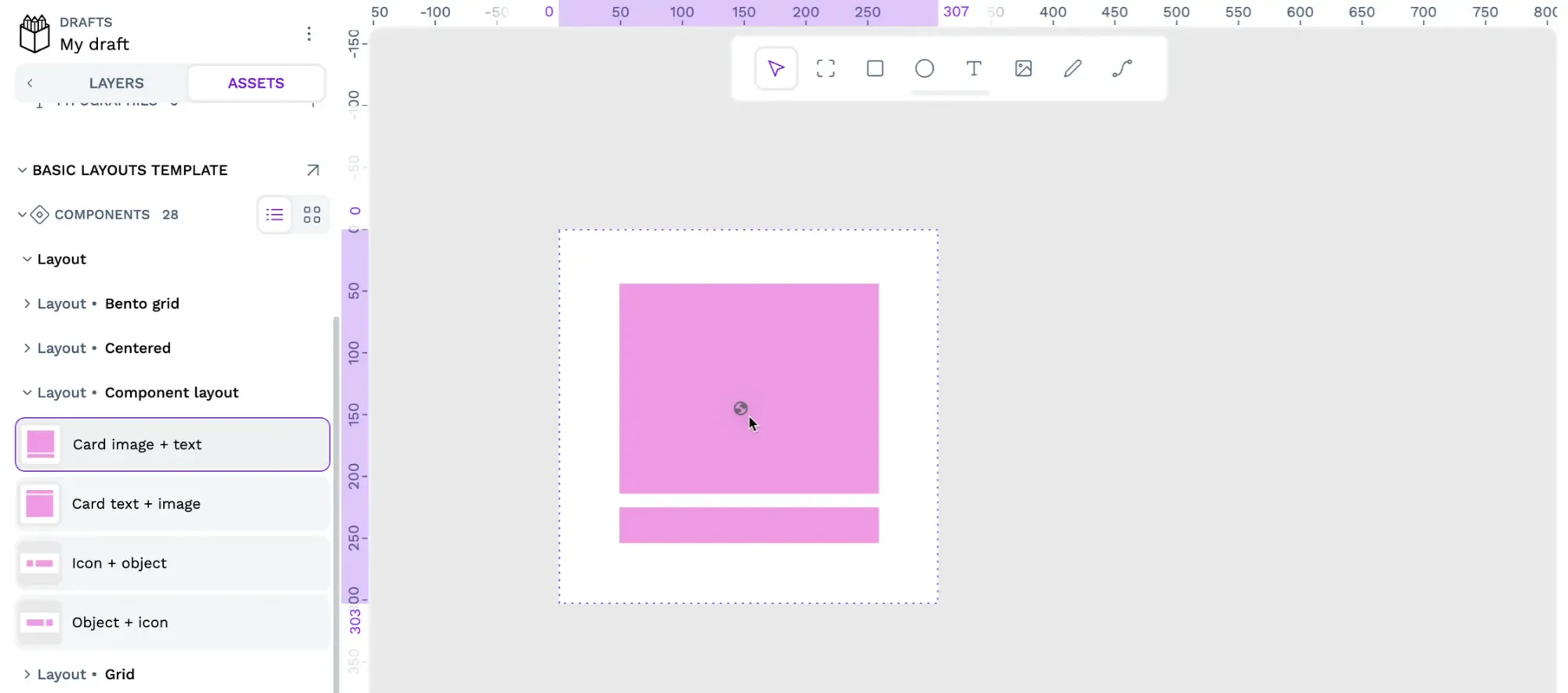
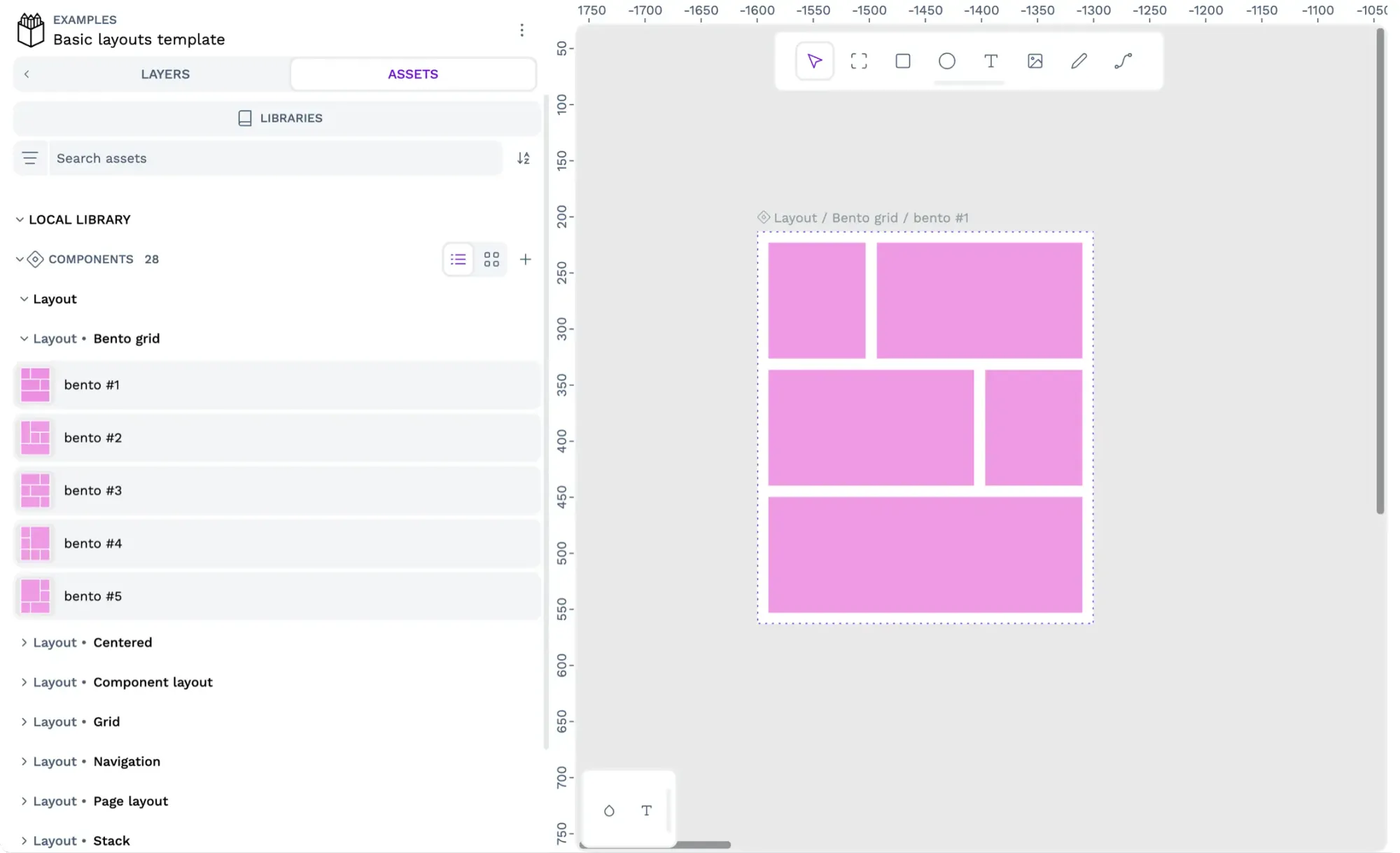
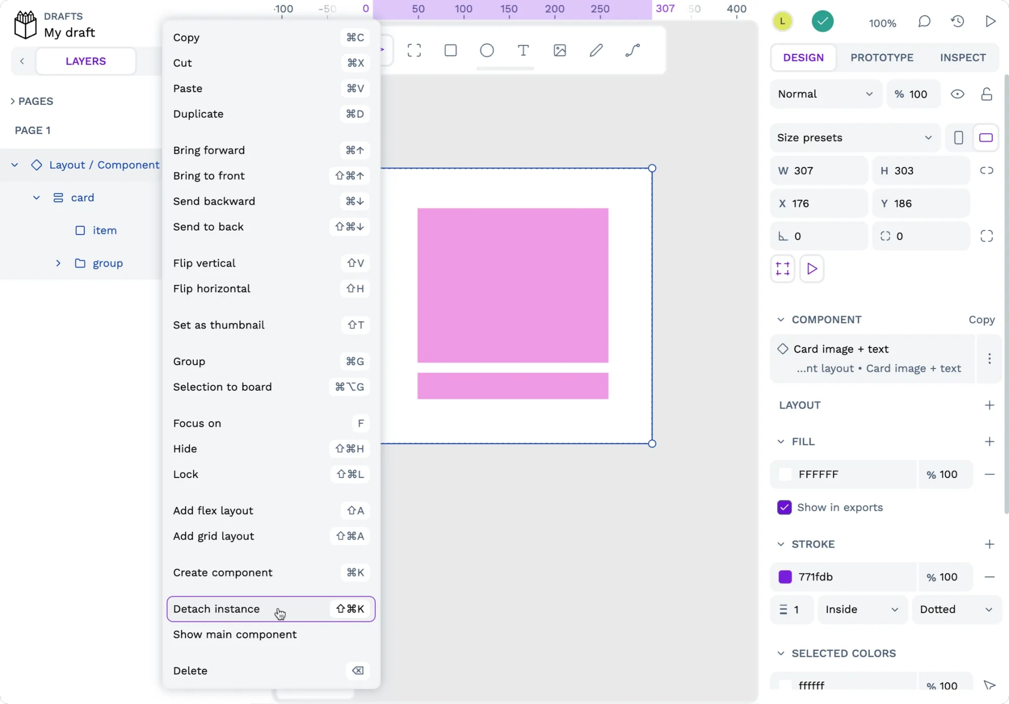
4: Drag the component from the sidebar onto the canvas and detach the layout from the component
You must first detach the instance from the component before you can add any new layers inside a layout component. Right-click the component on the canvas or the Layers panel in the left sidebar and choose Detach instance.
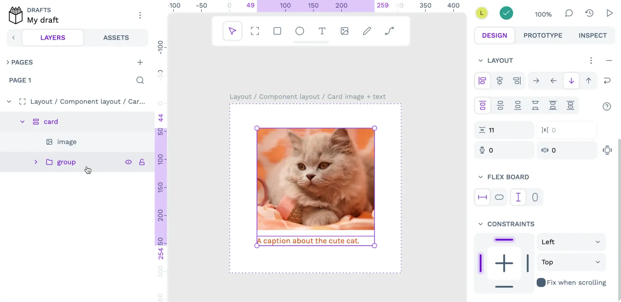
5: Use your layout
You can now put other layers inside your layout layer to automatically position them according to its flex or grid layout.
Use a layout component from another file
You can easily use a layout from my Basic layouts template (or any other file!) by copying it to your own. Start by importing the file into your Penpot dashboard and opening it up:
- Copy the layout component layer from the Layers panel in the left sidebar of your original file.
- Right-click the layer and choose Copy, or use the Ctrl/Cmd + C keyboard shortcut to copy the selected layer.
- Paste the layout layer into your new file.
- Right-click an existing layer, choose Paste, or use the Ctrl/Cmd + V keyboard shortcut to paste the layout layer into your new file.
- You must first detach the instance from the component before you can add any new layers inside a layout component. Right-click the component on the canvas or the Layers panel in the left sidebar and choose Detach instance.
- You can now put other layers inside your layout layer to automatically position them according to its flex or grid layout.
Create a layout component
You can create a layout component from either a board or a layer. Option 1 is to create an empty layout component using a board. Note that when using a flex layout, the board’s layout will be invisible until you add a layer inside because flex layouts adapt to their contents.
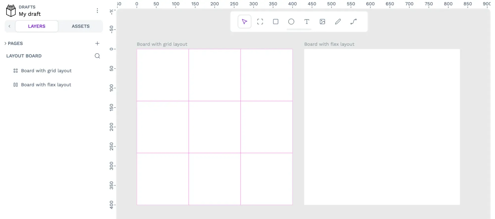
Option 2 is to create a layout component from a layer. Any layers inside the layout will be saved as part of the layout component, and these layers can be useful for previewing how the layout displays.
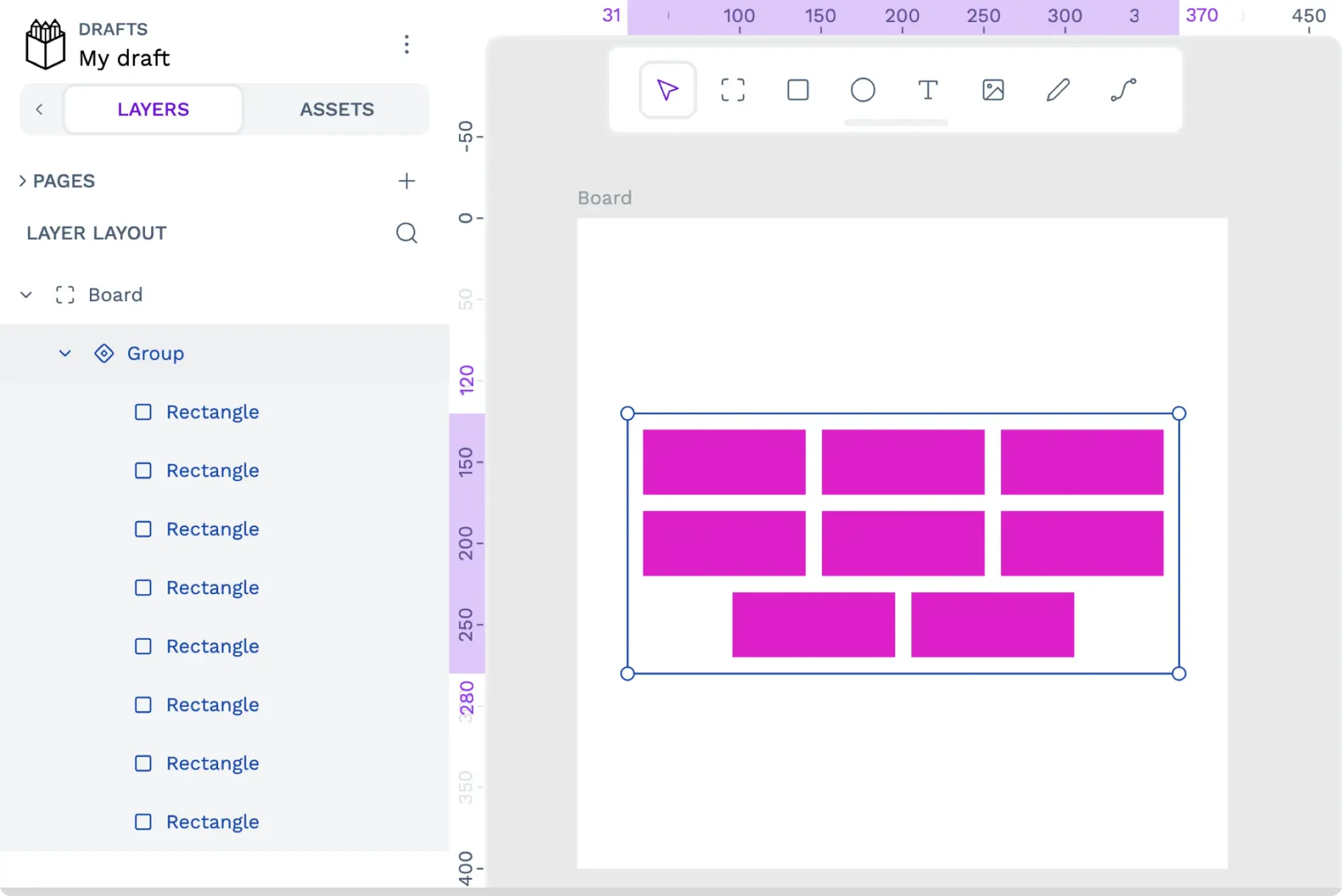
- Select your board or layer from the layers list in the left sidebar’s Layers panel.
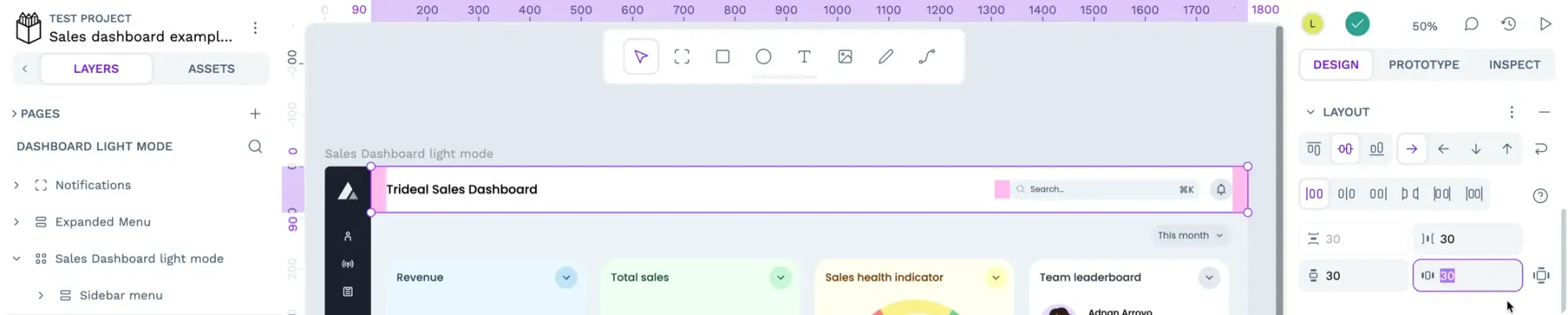
- Use the + icon button alongside the Layouts section in the right sidebar’s Design panel to create a grid or flex layout for that container. Read more about creating flex and grid layouts in Penpot.
- If you have any layers inside your layout layer or board, they will be automatically positioned according to the layout. Change their positioning for your component as needed.
- Right-click the layout layer and choose Create component, or use the ctrl/cmd + K keyboard shortcut to create a component. If you can’t see the option to create a component, it might be because you have another main component inside your layout layer. Main components can’t contain other main components.
Share your layout components
Have you recently created any reusable layout components that helped your project? You can share them with the Penpot community by contributing a library or template or even share your case study on the Penpot community. We’d love to hear from you.